
The Mailbox Dashboard syndrom.
Let's talk about this Mailbox dashboard below.
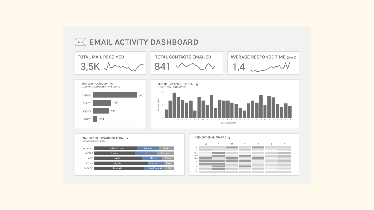
I created this dashboard using fake Gmail data. It includes indicators like:
- total emails received
- total contacts emailed
- average response time
- email classification by category
- date (day of the month and week)
- region and country of opening
However, something is off with this dashboard. The way it looks is fine, far from perfect, but ok.
I'm curious to know, after a moment of reflection, what you would improve about this dashboard.
Is there something that stands out to you? Something that seems off?
Join the game: spot at least two things that could be improved.
** Elevator music **
Now that you’ve looked at this dashboard, you’re probably among the majority who focus on aesthetics or features when giving feedback.
But the real issue with this dashboard is:
Who’s actually going to give a flying goat about this dashboard?
The answer : no one.
An email provider should help us access our emails quickly, reply easily, and check them anytime during the day.
Personally, I wouldn't want a page summarizing numbers before accessing my emails.
That's not the purpose of an inbox.
It's the same with your team's data. Some projects or tasks don't need a dashboard just because we have data.
This dashboard is a trap we all fall into sooner or later, creating something that looks fine but ultimately serves no one.
The Mailbox dashboard syndrom is a common issue I see in my work creating dashboards and training data teams.
I always try to bring a critical eye to ensure we only create solutions when they are necessary, useful, and add value to the company.
The Analytics Operating Review
A series of sharp visuals that decode common mistakes in Analytics.
We hate SPAM. We will never sell your information, for any reason.