
Documentation vs User guide
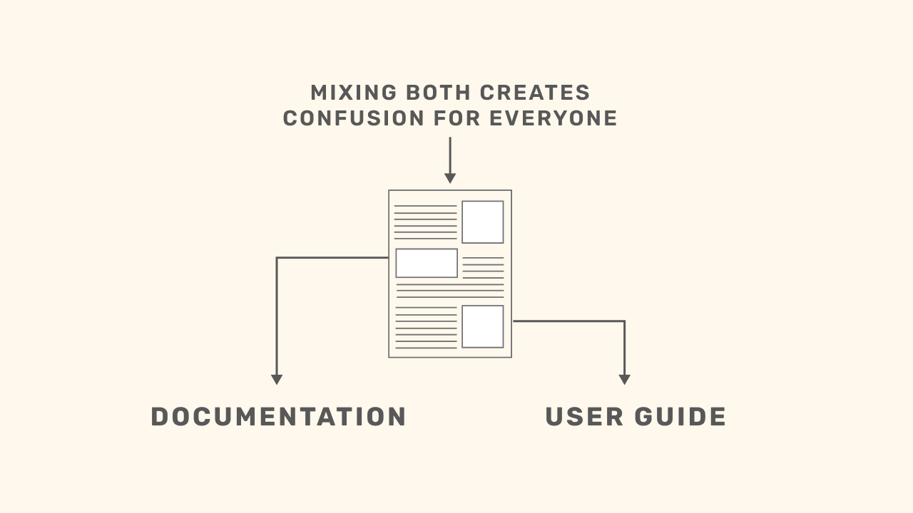
Most teams confuse two completely different things:
Documentation and the User Guide.
They serve different purposes.
For different people.
At different moments in the dashboard’s life.
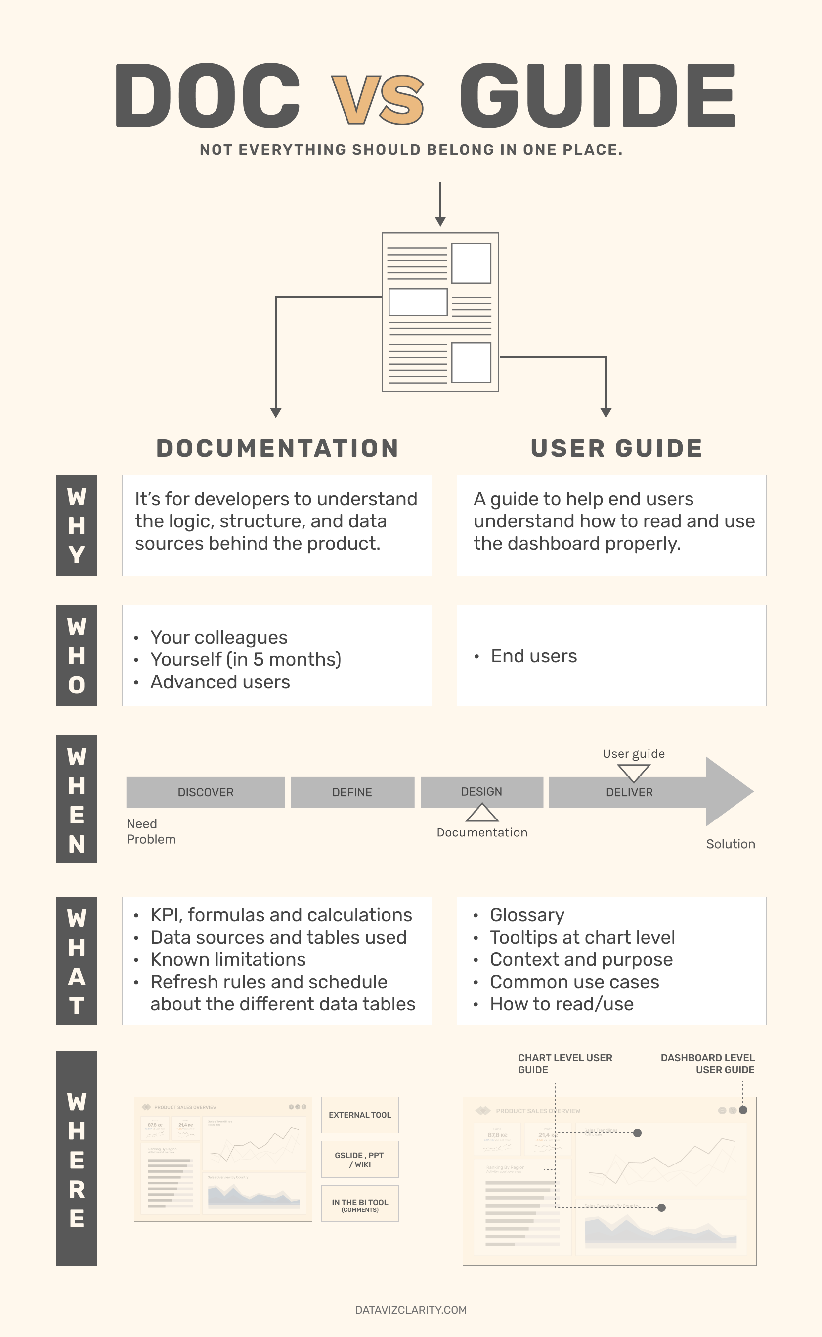
What is a documentation?
Definition from the web:
A technical reference that explains how something was built, so it can be understood, maintained, or improved later.
Applied to dashboards:
It’s for developers to understand the logic, structure, and data sources behind the product.
Who it’s for:
Your colleagues when they take over
You, in 5 months, trying to remember what you did
Common formats:
- Embedded in the back-end (annotations, comments, hidden tabs)
- A Google Doc or slide deck
- A resource in your organization's wiki
What it includes:
- Formulas and calculations
- Data sources and tables used
- Known limitations
- Refresh rules and schedule about the different data tables
What is a user guide?
A tool to help end users understand how to read and use the dashboard properly.
Different purpose. Different audience.
Common formats:
- A dedicated space inside the dashboard
- Tooltips or embedded help at chart level
- A Google Slide, or onboarding deck
- Your company’s analytics portal or internal wiki
What it includes:
- Plain-language KPI explanations
- How to interact with the dashboard
- What the dashboard is and isn’t meant for
- Guidance on how to read and interpret visuals
- Update frequency
Understanding the difference between documentation and user guide is a great first step but it’s not enough on its own.
If you stop there, you’re just putting labels on two containers.
To truly help the business, you need to go further:
- Apply a product vision.
- Follow a design process.
- Treat dashboards like real products not just report
 (Right click and 'save as' to download the high resolution visual)
And yes, all that without sacrificing time-to-market.
Because in the end, the goal isn’t just to ship a dashboard.
It’s to create the right product, for the right problem, for the right people.
Like this? There’s more coming, straight to your inbox. Join the newsletter below.
The Analytics Operating Review
A series of sharp visuals that decode common mistakes in Analytics.
We hate SPAM. We will never sell your information, for any reason.