
Data-to-Decision Leakage
Most data teams track what they produce.
Number of dashboards.
Number of reports.
Number of requests delivered.
It looks like performance.
It’s not.
I think most organizations have no idea how much value they lose between data and decisions.
Not because of tools.
Not because of skills.
Because of what I’d call data-to-decision leakage.
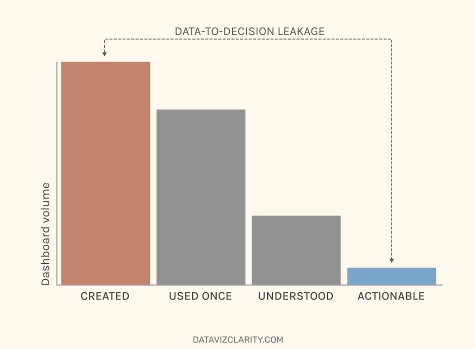
Data is collected.
Dashboards are created
Used once
Understood (sometimes)
Actionable (never)
Somewhere along the way, value disappears.
Silently.
A dashboard is opened.
No decision is made.
A report is delivered.
No action follows.
A request is completed.
The business exports to Excel anyway.
But none of this is measured.
Instead of asking: "How many dashboards did we deliver?"
Ask something much simpler.
Was a decision actually made in the last 3 months because of this dashboard?
If the answer is no, you should be worried.
Because it means:
- the dashboard is not tied to a decision
- or the decision happens somewhere else
- or no decision is needed at all
In all three cases,
The value is not where you think it is.
I believe this is where most data teams get stuck.
They improve outputs. But outputs are not the goal.
What to do instead
Start simple.
For each dashboard, ask:
- What decision is this supposed to support?
- Has a decision been made recently because of it?
- What changed as a result?
Even rough answers are enough.
Because right now, most companies have a leakage problem.
Data goes in. Dashboards come out.
Decisions don’t.
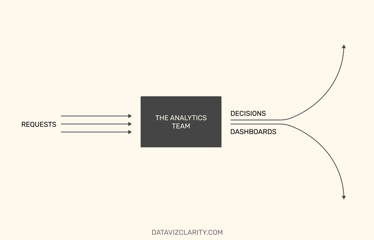
And the more you produce, the more you lose.
If you want to go further, the next step is obvious:
Map where value breaks in your current setup.
Not in theory. In reality.
That’s usually where things get uncomfortable.
And that’s exactly the work I’m currently doing with a small group of companies across Europe and the US.
I’ll be opening this up more broadly in the next newsletter, with a dedicated diagnostic offering.
🇫🇷 En français :
In English :
Have a great week!
Aurélien

Responses