
What could go wrong during Design? - Part 3
By the time teams reach the design phase, patience is already gone.
Discovery took longer than expected.
Calendars were difficult to align.
Stakeholders are tired.
So design gets rushed.
Small workshops.
Quick calls.
Half the audience missing.
Compromises disguised as solutions. And the team moves faster.
The real problem
The visible symptom is chaotic dashboard design.
Sketches appear late.
Ideas are half-formed.
People jump straight into BI tools.
Design is treated as a production step instead of a thinking step.
Instead of exploring multiple solution hypotheses, teams rush to simplify the problem so they can start building something.
But design should do the opposite.
It should reopen the space of possibilities.
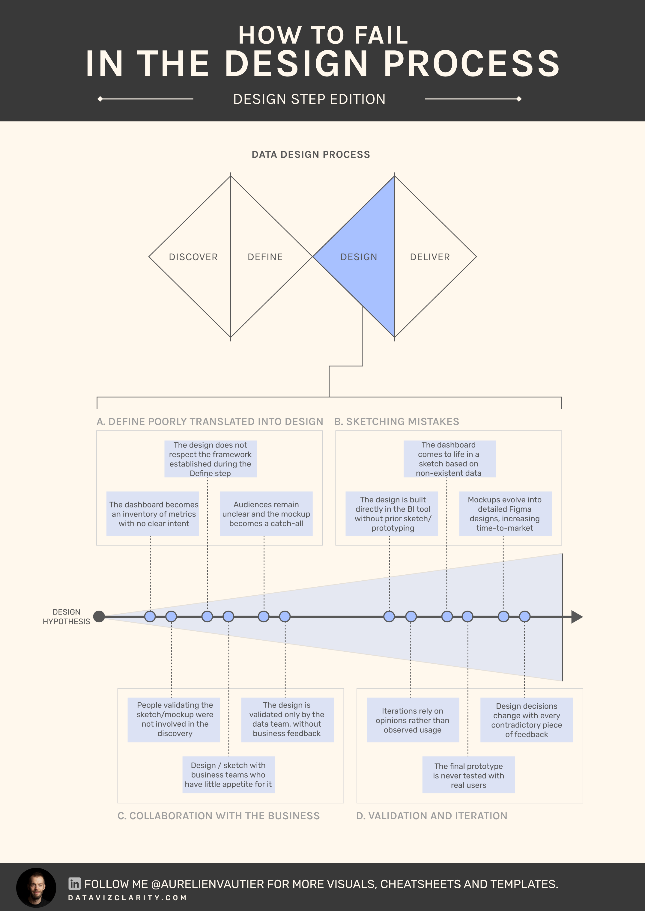
The hidden cost of rushed design
I see this pattern repeatedly in analytics teams once design begins.
- No sketches. The team jumps straight into development.
- Fifteen days are spent building dashboards in BI tools.
- Business stakeholders say: "This isn’t what we expected."
- The team cannot realistically go back two weeks.
- Changes are made directly in Tableau or Power BI instead of revisiting the design.
- The team moves forward quickly on an unvalidated solution.
What could have taken a few hours now takes several weeks.
Before building anything, teams should deliberately diverge again.
Four design questions structure the step.
-
Decision flow
What decision should the user reach? What information leads there? -
Product type
Is the solution monitoring, exploration, explanation, or a mix? -
Persona paths
Different audiences require different entry points and levels of detail. -
Call to action
What should the user do next?
This step produces a solution architecture, not a dashboard.
Possible outcomes include:
• A cockpit for leadership monitoring
• Two exploratory dashboards for operational teams
• Detailed tables supporting investigation
The final dashboard is only one element of the solution.
A quick corporate example
An analytics team receives a request: "We need a dashboard to monitor sales performance."
After a quick Discover and Define step, Design begins under pressure.
A single dashboard is sketched.
It contains KPIs, trends, filters, comparisons, and breakdowns.
After launch, leadership finds it too complex.
Regional managers ask for exploration capabilities.
Finance asks for explanation of anomalies.
Three new dashboards appear.
The team didn’t design a solution.
They designed three pages with no connection.
What started as speed turned into fragmentation.
The product will be redesigned within six months.
If dashboards in your organization keep multiplying without increasing decision quality, it may be time for a methodology diagnostic.
Book a call here:
Have a great week everyone!

Responses