
The forgotten step between business needs and charts: Metric Design
I'm writing this week's newsletter from the Périgord region - France, where I'm taking a week off with my family.
Being here made me think about something.
Last year, 87% of my consulting revenue (workshops, coaching and advisory) came from French companies.
That made me wonder:
- Does writing in English make this newsletter less enjoyable or harder to read?
- Does it stop you from using or sharing resources like the cheat sheets, cards, templates and visuals I create?
I'm considering publishing every newsletter in its original French version alongside the English one.
I'd genuinely love to hear your opinion.
Just hit Reply and tell me what you think.
- - -
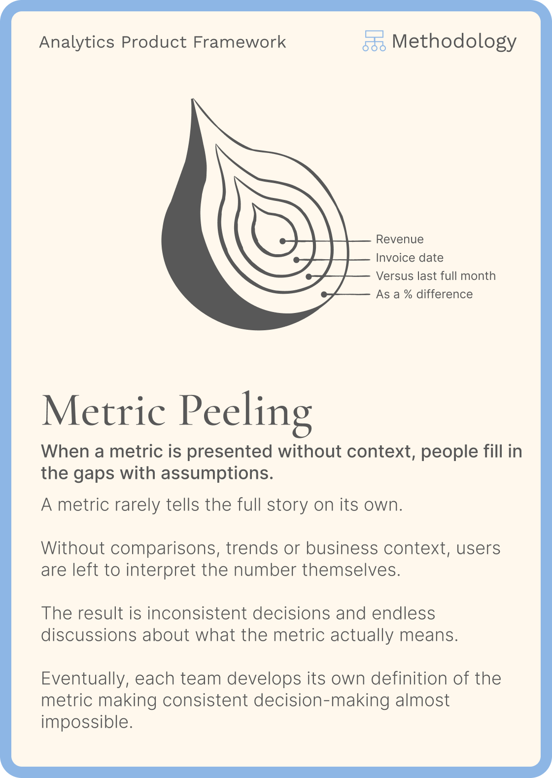
One of the most common pitfalls for BI developers and data analysts is skipping Metric Design.
Once the business question is clear, they move directly to chart selection instead of refining how the metric should be expressed, calculated, compared, and interpreted.
The result is often a dashboard that is technically correct but fails to answer the user's real question.
One of my clients in the transportation and logistics industry has an interesting practice.
Before a single metric is allowed onto a dashboard, it goes through a series of design decisions.
For every metric, the team agrees on:
- Name: What should we call it?
- Business definition: What exactly are we measuring?
- Calculation: How is it computed?
- Scope: What's included and excluded?
- Granularity: Per shipment, order, customer, vehicle, warehouse...?
- Time: Daily, weekly, monthly, year-to-date...?
- Aggregation: Total, average, median, percentage, ratio...?
- Comparison: Previous period, last year, target, forecast, benchmark...?
- Target: Does it need one?
- Formatting: Number, percentage, currency, decimals..
- Visualization: Only then do they choose the chart.
The chart is the last decision.
By the time they reach it, everyone already agrees on what the metric means and how it should be interpreted.
Choosing the visualization becomes almost obvious.
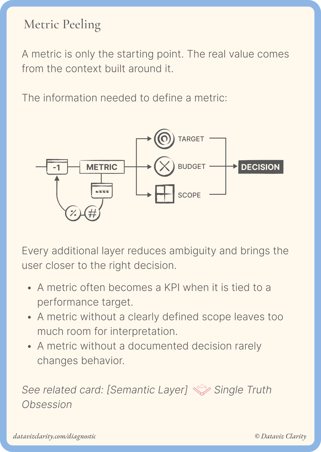
Many dashboard problems actually start long before the first chart is created.
If you'd like to teach your team a practical approach to Metric Design, I offer interactive workshops that help analysts and business teams get metrics right before they reach your semantic layer, dashboards, or AI agents.
See you next Tuesday.
Aurélien
Whenever you're ready, there are four ways I can help you and your team:
- Analytics Product Office: Give your team a dedicated Analytics Design Office: one ticket board, one place to ask questions, fast expert responses directly from me. Get support on user interviews, workshop facilitation, product thinking, methodology, communication, and analytics product practices whenever you need it.
- Analytics Diagnostic: Identify your biggest analytics challenges and priorities (for teams).
- E-Learning: Learn Design Driven Dataviz: Master the fundamental design principles behind clear, intuitive, and impactful dashboards that people actually use.
- Youtube channel: Short videos about data strategy, analytics and data teams.

Responses