
Every analytics product should pass these three tests
During a recent workshop, several participants admitted they didn't know how to judge whether an analytics product was "good".
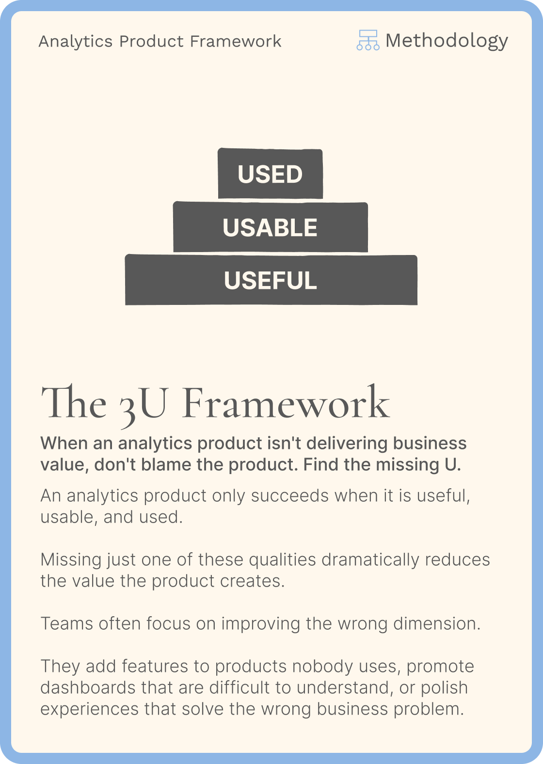
Then I wrote three letters on the whiteboard:
Useful. Usable. Used.
From that point on, every discussion became simpler.
The mistake I see repeatedly
Many teams focus on the last U first.
- They communicate internally.
- They monitor adoption.
- They organize training sessions.
- They ask why nobody uses the dashboard and cry.
But usage is often a symptom, not the problem.
The real question is:
Should this product have been built in the first place?
I know you're thinking about Jose's dashboard. Is it useful? Not really. Does the CEO love the map? Absolutely. That's exactly why Jose is getting promoted, not you (I'm kidding...I hope)
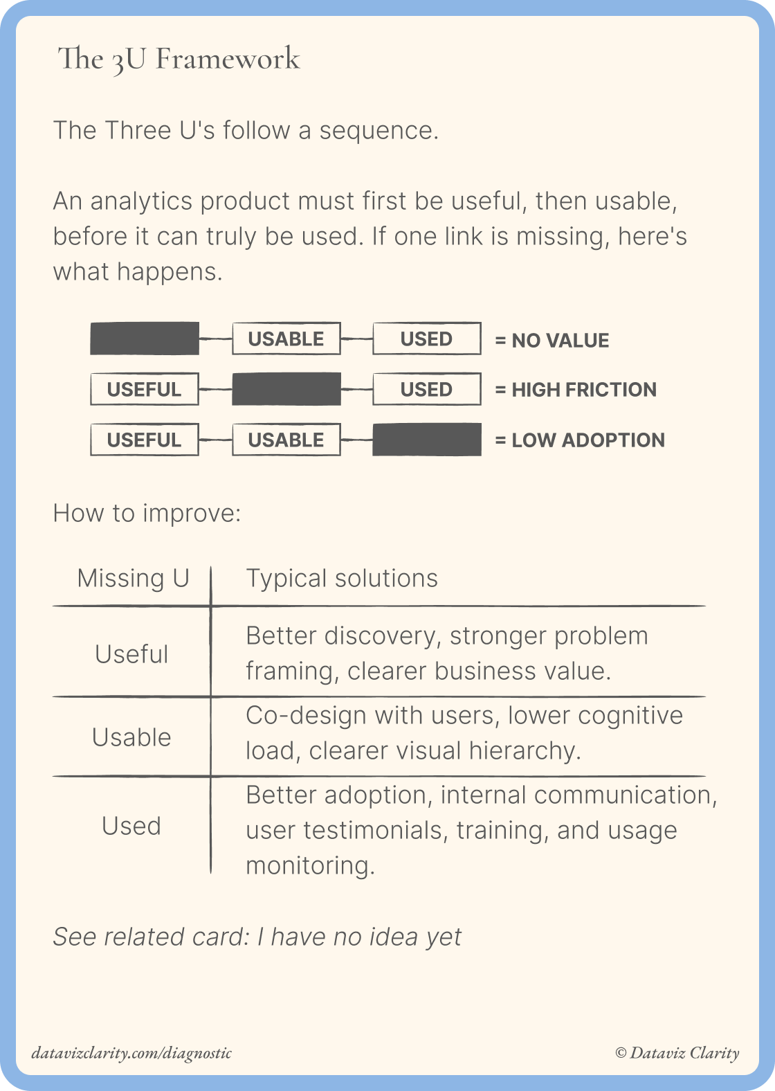
The Three U's are sequential
Every analytics product should pass through three gates.
1. Useful
Does it solve a real business problem?
Does it help someone make a better decision?
If the answer is no, nothing that follows matters.
This is where discovery happens:
- user interviews
- workflow observation
- challenging requests
- understanding decisions
- defining value
Everything here is part of the Analytics Framework workshop I deliver to companies around the world.
2. Usable
Assuming the product is valuable...
Can users actually use it?
Can they find what they need?
Understand it quickly?
Trust the numbers?
Navigate without friction?
This is where design makes the difference.
This section is part of the Design Principles for Analytics workshop I deliver every month to companies of all sizes and across industries.
3. Used
Only then should you ask:
Will people actually use it?
This is where adoption begins:
- Feedback
- Communication
- Training
- Champions
- Documentation
These activities help a good product spread.
They rarely save a bad one.
How it fits into an analytics framework
I use the Three U's as checkpoints throughout the design process.
Discovery => Useful : Validate the problem before thinking about charts.
Design => Usable : Reduce friction before thinking about adoption.
Adoption => Used : Promote the product once it deserves to be adopted.
A useful question for your next project
Instead of asking:
"How do we increase dashboard adoption?"
Ask:
"Which U is actually missing?"
Maybe users don't understand it.
Maybe it solves the wrong problem.
Maybe it's simply unknown.
The answer determines your next action.
See you next Tuesday.
Aurélien
Whether you need training, advisory, ongoing support, or a transformation, here's how I can help.
- Analytics Product Office: Give your team an experienced partner to strengthen analytics product practices, from user interviews and workshop management to product thinking, methodology, communication, and facilitation skills (for teams).
- Analytics Diagnostic: Identify your biggest analytics challenges and priorities (for teams).
- E-Learning: Learn Design Driven Dataviz: Master the fundamental design principles behind clear, intuitive, and impactful dashboards that people actually use.
- Youtube channel: Short videos about data strategy, analytics and data teams.
Responses