
The Dashboard Portfolio Matrix + Use Case
Every dashboard is an asset.
Assets have a lifecycle. Some create tremendous value. Others were useful two years ago.
Some are opened every day. Others haven't been touched in months.
Yet they continue to:
- consume infrastructure
- generate maintenance work
- complicate governance
- increase migration costs
- create confusion
Cloud costs often reveal this problem.
Thousands of reports suddenly need to be inventoried, migrated or rebuilt.
Not because they are valuable.
Simply because nobody knows whether they are.
One question changes everything:
If I had to rebuild my analytics platform tomorrow...
Which dashboards deserve to survive?
Very few teams can answer, because they lack a portfolio view.
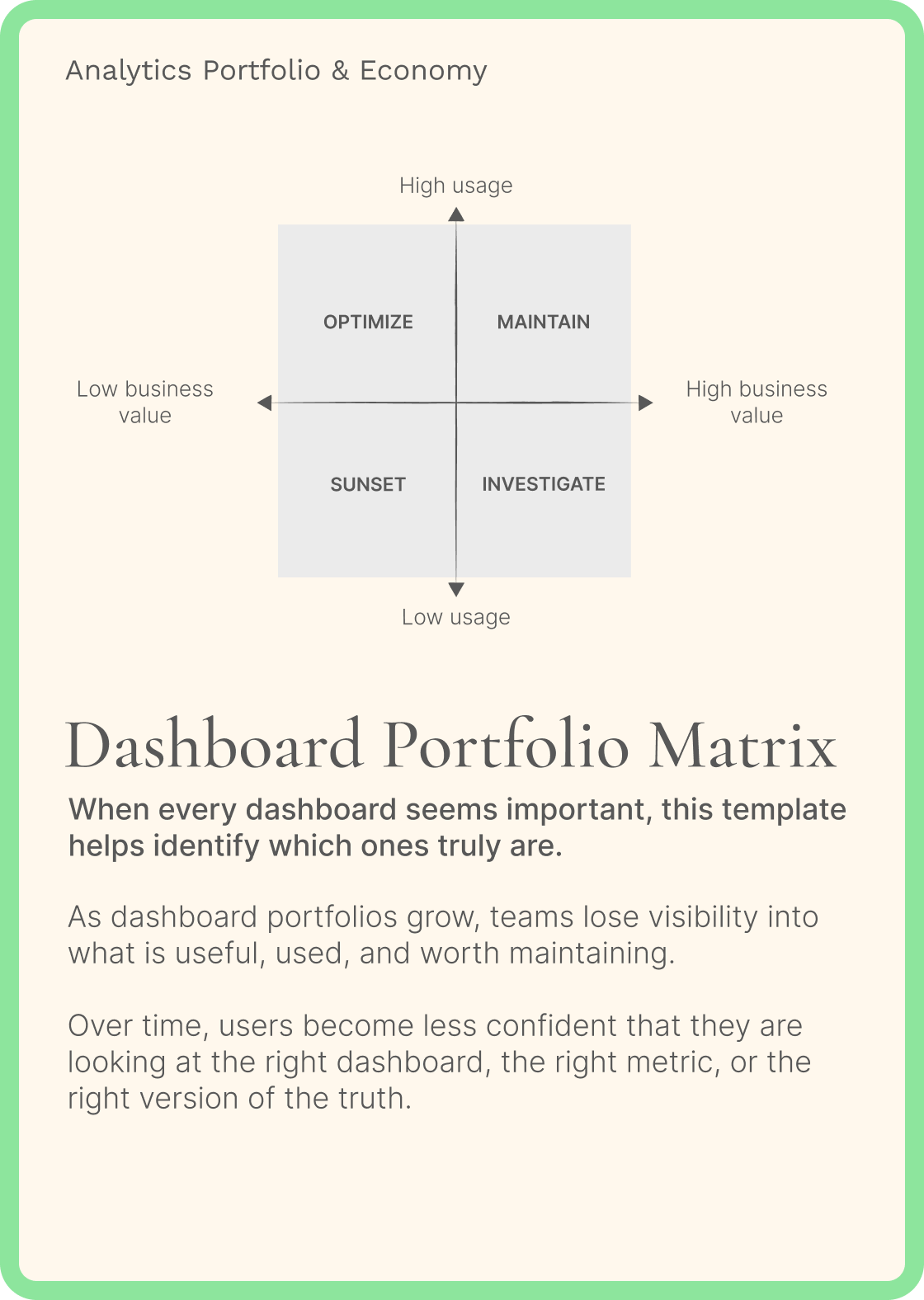
This is why I created the Dashboard Portfolio Matrix.
The framework maps every dashboard/report using two simple dimensions:
- Business Value
- Usage
Once everything is positioned on a single canvas, priorities become obvious.
- Some dashboards deserve investment.
- Some deserve redesign.
- Some require investigation.
- Some should simply disappear.
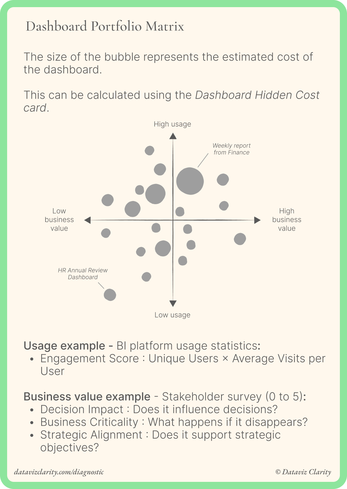
A simple spreadsheet and a short survey are often enough to create the first version of your portfolio.
Every dashboard you decide not to retire today becomes another dashboard you'll eventually have to migrate, maintain or redesign tomorrow.
A real-world example
A logistics company in the Netherlands had accumulated more than 1800 dashboards on Tableau over the years.
The issue wasn't immediately visible until the organization migrated its data platform to the cloud.
As cloud consumption increased, FinOps costs started to rise sharply, I'm not going to say "I told you so". Every dashboard, whether valuable or not, generated storage, compute, maintenance and migration costs.
Fun fact : nobody could answer basic questions:
- Which dashboards create business value?
- Which ones are actually used?
- Which ones should be redesigned?
- Which ones could be retired without any impact?
The project started as a cost optimization initiative. *Aurélien not happy*
It quickly evolved into an analytics portfolio management initiative. *Aurélien happy*
The Dashboard Portfolio Matrix was one of the frameworks we used, but it was only one part of a much broader assessment.
Rather than reviewing all 2800 dashboards individually, we selected a representative sample of 100 dashboards and conducted a comprehensive audit.
For each dashboard, we combined:
- usage analysis
- interviews with business users
- discussions with analytics leaders
- interviews with developers
- design and usability reviews
- data quality assessments
- and business value assessments.
The outcome was a detailed portfolio diagnosis, providing clear recommendations on which dashboards should be retired, redesigned, simplified or preserved.
The final results were significant:
- 45% of the dashboards were retired
- 15% were redesigned
- 20% were replaced by simpler analytics assets, such as alerting, small reporting or subscribes.
- 20% remained essentially unchanged because they already delivered clear business value
The biggest outcome wasn't just lower cloud costs.
For the first time, the company had a complete picture of its analytics portfolio and could make investment decisions based on value instead of assumptions.
The conversation shifted from:
"How can we reduce BI costs?"
to:
"Where should we invest to maximize the value of our analytics assets?"
That's the purpose of analytics portfolio management.
Reducing the number of dashboards is fine.
Making deliberate investment decisions across your analytics portfolio is way better.
This week's challenge
How many dashboards do you think your organization could retire tomorrow without anyone noticing?
Hit reply and share your answer. I read and respond to every email personally.
I'll share the most interesting insights anonymously in next week's newsletter.
Have a great week everyone!
Aurélien
Looking for more analytics insights?
- Analytics Diagnostic: Identify your biggest analytics challenges and priorities (for teams)
- Learn Design Driven Dataviz: Master the fundamental design principles behind clear, intuitive, and impactful dashboards that people actually use.
- Youtube channel: Short videos about data strategy, analytics and data teams.
- The Analytics Operating Review: Weekly insights for data and analytics professionals. Feel free to forward this email to anyone who might find it useful.

Responses