
What a Metric audit can uncover in one day
Today's issue is about Metric Peeling, why metrics that seem obvious often aren't, and how getting their definitions right can prevent confusion, inconsistencies, and endless debates around numbers.
Metric Peeling can be very important and necessary in situations where people are so deep in the day-to-day that they end up using metrics and KPIs as if everyone understood them.
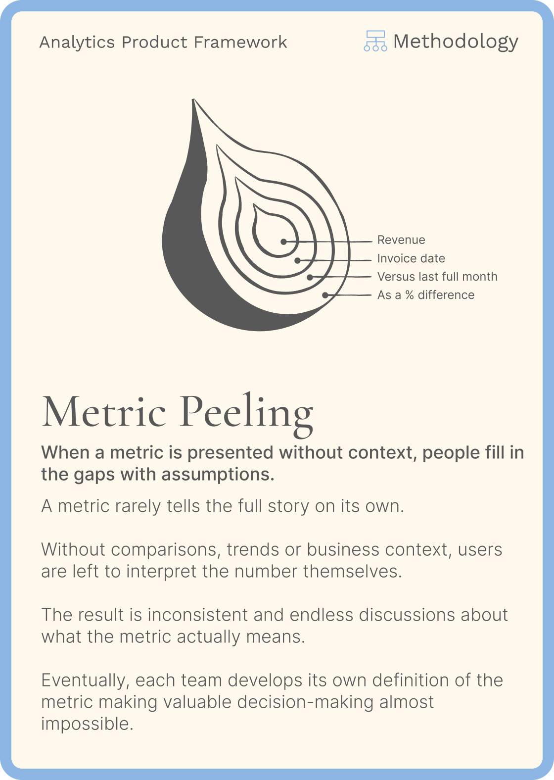
I think business teams have too much of a tendency to believe that they understand what we're talking about.
Some metrics and KPIs are calculated differently, on different scopes, over different timelines, have different definitions, and have different representations.
As data team, it's important to be very clear about these topics.
Not every company has a dedicated data governance team or a clean semantic layer, and it's often the data team that pays the price for the multiplication of truths, definitions, and usages.
The impact is teams using the same indicators but not understanding the results or the discrepancies, and eventually spending the majority of their time checking and trying to understand the differences between the numbers from one team to another.
This is what I call metrics paranoia.
By defining Metric Peeling through this approach and documenting these metrics and KPIs, we make sure that we're all aligned and that there isn't necessarily only one source of truth.
There can actually be several definitions for the same metric, and that's fine as long as each one makes sense in its context.
A more specific example
On-Time Delivery Rate in a supply/logistics team.
At first, the metric seems clear:
% of orders delivered on time.
But start peeling it:
What does "on time" mean?
1. The Sales team might define it as:
Delivered on or before the date promised to the customer.
2. The Logistics team might use:
Delivered within the carrier's expected delivery window.
3. Operations might calculate it based on:
The original planned delivery date, while Customer Service uses the latest delivery date communicated to the customer after rescheduling.
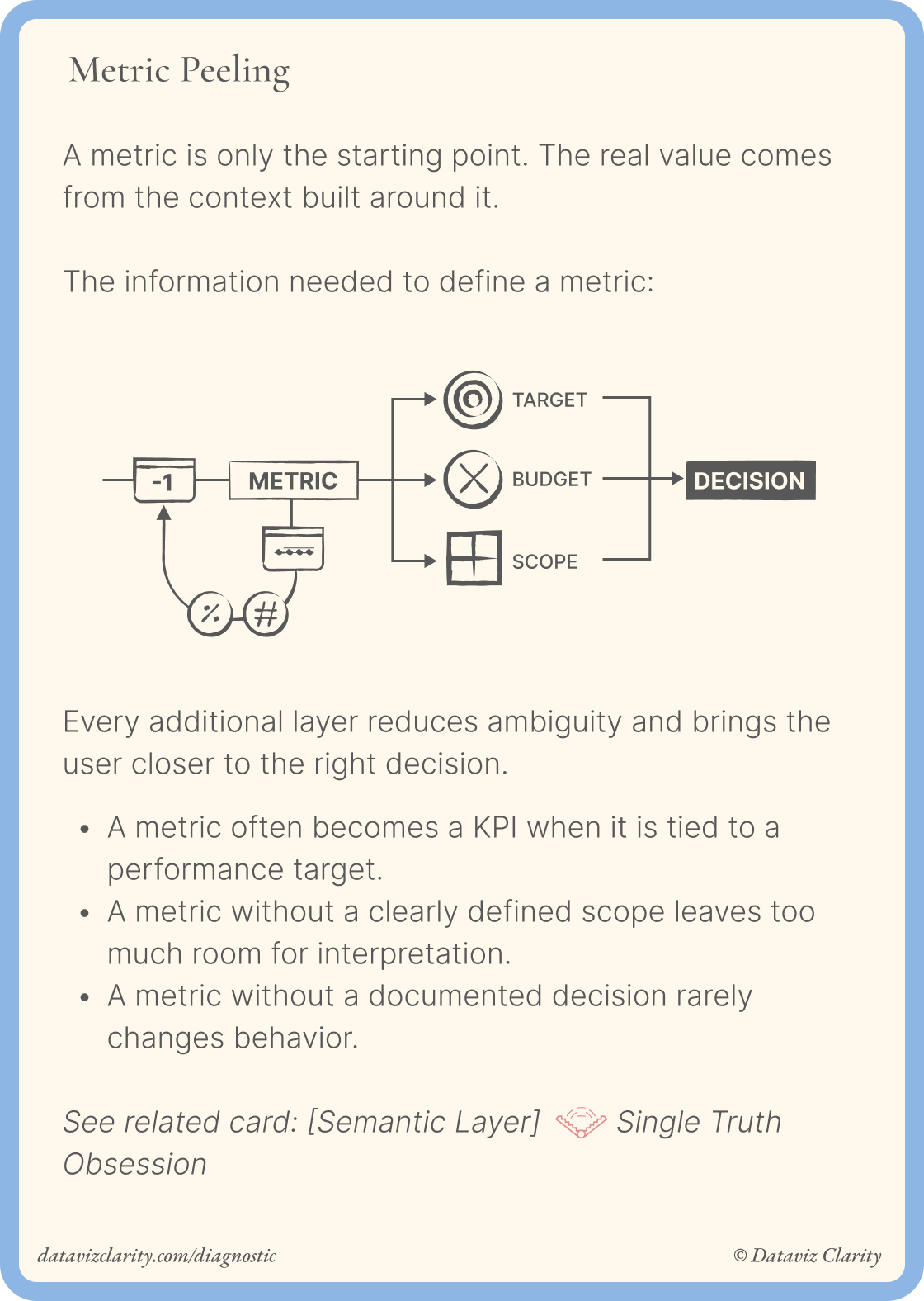
Then you peel further:
- Are weekends included?
- What about customer-requested postponements?
- Are cancelled orders excluded?
- Do partial deliveries count?
- Which timestamp proves delivery?
- Is the metric calculated per order, shipment, or item?
You can easily end up with 94% on-time delivery in one dashboard and 87% in another, with both being technically correct.
Why business teams go back to Excel
When these metrics aren't clear, business teams start asking questions.
When they don't get enough clarity, they ask to extract the data and redo the calculations themselves.
This is exactly how you turn your analytics capabilities, with Power BI, Tableau, or any other BI tool, into data extraction platforms and gradually lose trust in analytics.
That's exactly where Metric Peeling matters: before trying to fix the numbers, you need to understand what each number actually means.
What one day of metric auditing revealed
I recently audited the calculation of two metrics that two business teams couldn't agree on.
The differences came from:
- Different join directions
- Different join keys
- Different scopes
- Different definition
- Different data enrichment
- Different datasets
- Different goals
It took one full day of auditing and mapping the calculation process visually to uncover where the discrepancies were coming from.
Both teams were talking about the same metrics.
But underneath, they were effectively calculating two different things.
At the end of the audit, I delivered a complete visual one-pager mapping both calculation processes side by side, making the differences immediately visible and creating that "aha" moment for both teams.
Question: What did you think of today's issue? Hit reply and tell me what resonated, or what you disagree with.
Have a great week everyone!
Aurélien
Whenever you're ready, there are four ways I can help you or your team:
- Workshop with me: One-day workshops to learn design principles, improve your design process, build your design system, or help business teams make better decisions with data.
- Analytics Product Office: Give your team a dedicated Analytics Design Office: one ticket board, one place to ask questions, fast expert responses directly from me. Get support on user interviews, workshop facilitation, product thinking, methodology, communication, and analytics product practices whenever you need it.
- E-Learning: 6+ hours of on-demand content, interactive lessons, and practical exercises to master the fundamental design principles behind clear, intuitive, and impactful dashboards

Responses