
A template to understand users’ experiences, environment and emotions.
How can data teams understand the reality behind business needs?
Analytics interviews can quickly drift toward features, metrics, technical constraints, and requested solutions.
The Empathy Map, created by Dave Gray, gives you a simple structure to keep exploring the user's environment, behaviors, perceptions, frustrations, and emotions.
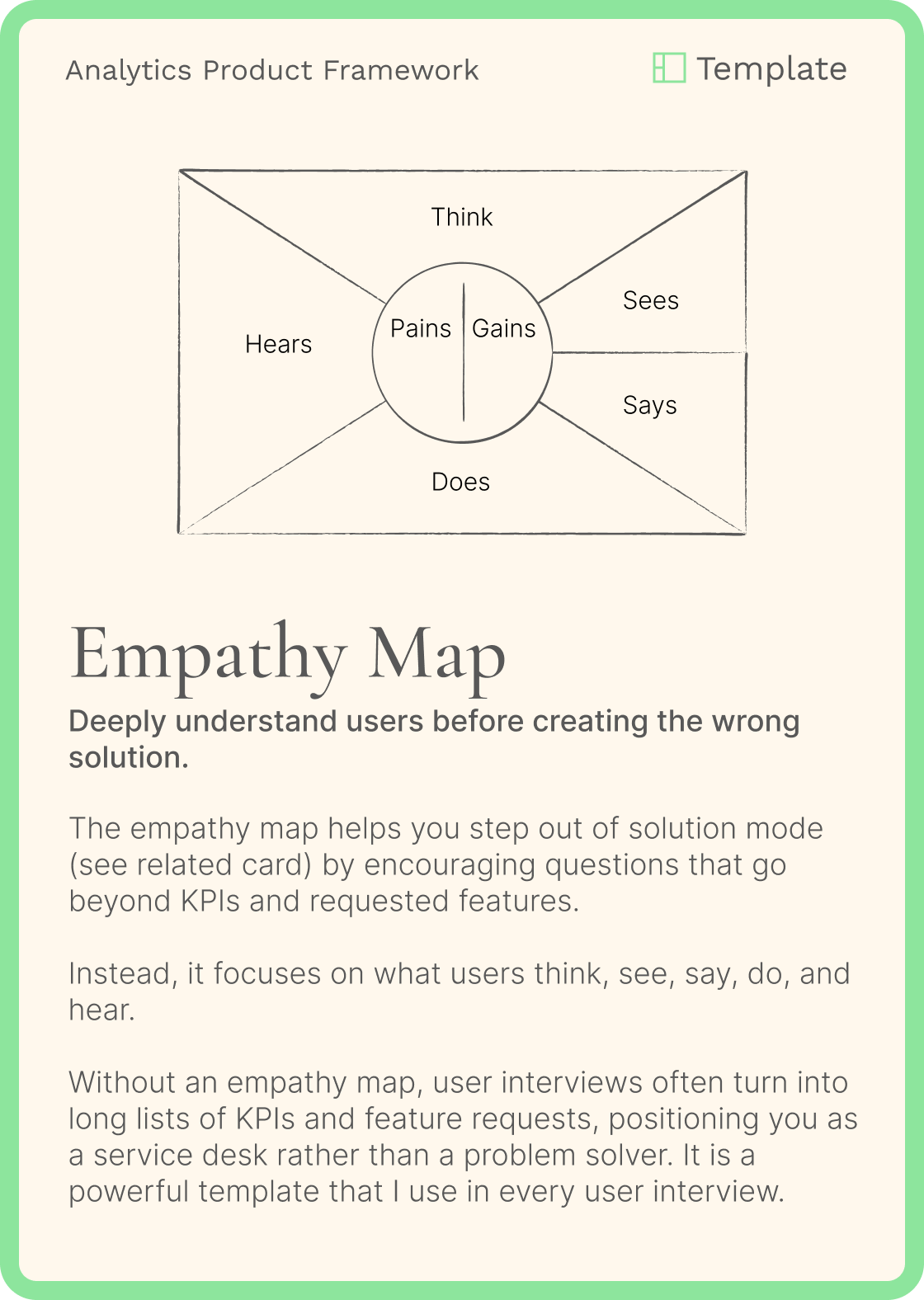
It constantly reminds me to explore areas I might otherwise forget:
What do they see?
What does their working environment look like?
What do they hear?
What do colleagues, managers, or other teams say?
What do they think and feel?
What frustrates, worries, or motivates them?
What do they say and do?
How do they actually work and make decisions?
For technical questions, I still use a traditional interview guide.
The Empathy Map serves a different purpose: keeping the conversation grounded in the user's experience.
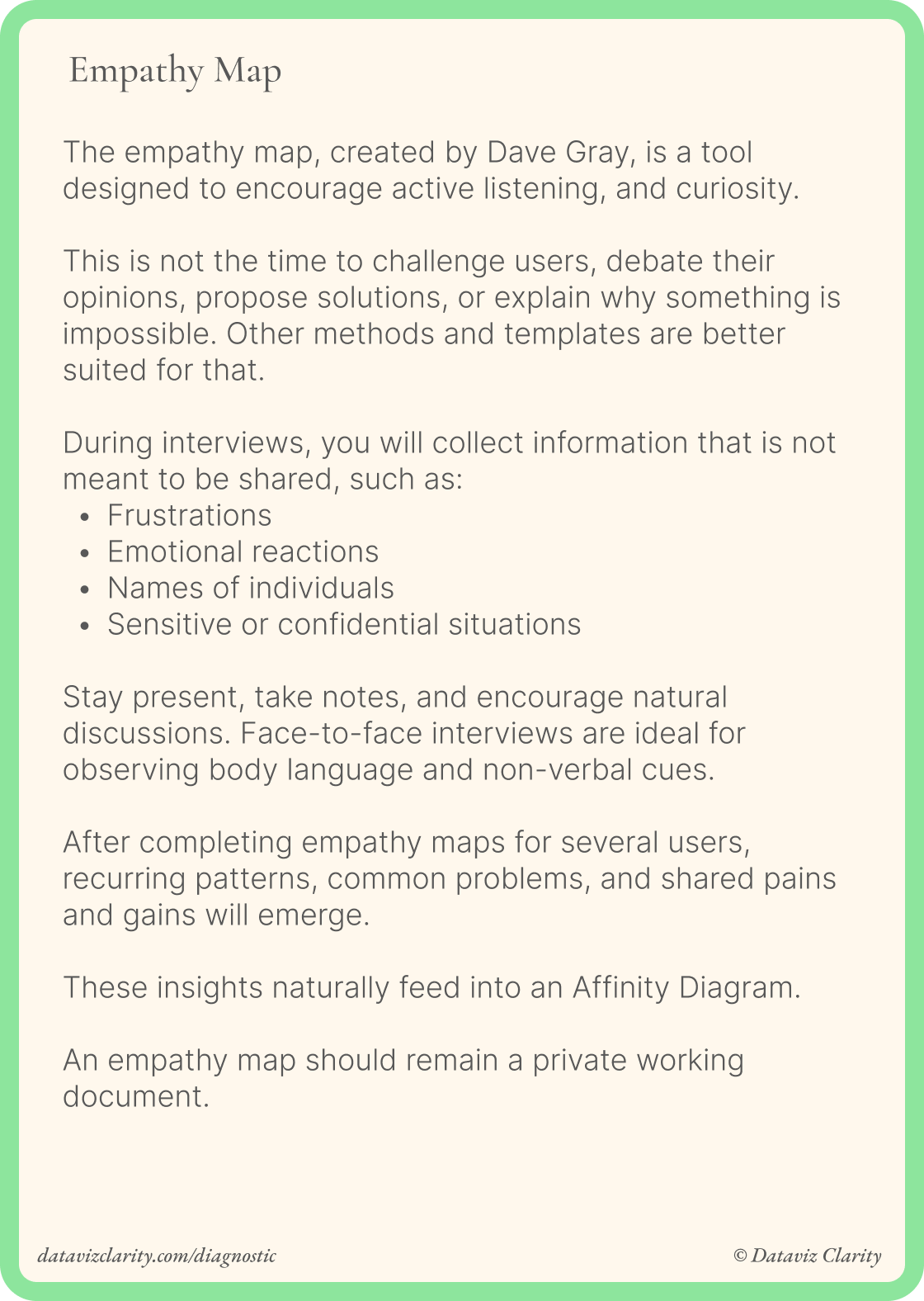
Two ways to use it
During the interview
Use the canvas as your note-taking structure. It becomes a visual reminder of areas you haven't explored yet and helps you generate follow-up questions.
After the interview
Transfer your notes onto the canvas to synthesize what you learned, identify patterns, and compare perspectives across users.
I personally prefer the first approach.
It helps prevent me from being pulled too quickly into functional and technical discussions.
A question that changed an interview
I once interviewed a user we'll call Michael.
The interview was going fine, but his answers remained quite factual and somewhat guarded.
Near the end, I asked a question inspired by the "Hear" dimension:
What do you hear your colleagues say about how you work with data?
His posture completely changed.
"Oh... they probably think it's terrible. They think I'm old school. I export everything, I love Excel..."
That answer opened an entirely new conversation.
I could explore why he systematically ask for filters and exported data, why spreadsheets felt safer to him, why he avoided data visualization, and what he actually needed from analytics tools.
None of that had emerged from asking what metrics or dashboards he needed.
Have a great week everyone!
Aurélien
Whenever you're ready, there are four ways I can help you and your team:
- Workshop with me: One-day workshops to learn design principles, improve your design process, build your design system, or help business teams make better decisions with data.
- Analytics Product Office: Give your team a dedicated Analytics Design Office: one ticket board, one place to ask questions, fast expert responses directly from me. Get support on user interviews, workshop facilitation, product thinking, methodology, communication, and analytics product practices whenever you need it.
- Analytics Diagnostic: Identify your team's biggest analytics challenges through interactive workshops.
- E-Learning: Learn Design Driven Dataviz: Master the fundamental design principles behind clear, intuitive, and impactful dashboards that people actually use
Responses