0

New workshop for Analytics teams now live!

Header Logo
Newsletter Blog Contact
Workshops
Design Principles for Analytics
Log In
← Back to all posts

The first card has arrived.

May 19, 2026
Connect

Last week, I challenged myself to start creating a library of cards.

Each card captures a recurring trap, friction, or pattern I have seen repeatedly in analytics and BI teams.

The goal is simple:

  • Put a name on situations many teams experience but struggle to articulate.
  • Show that these problems are common and well understood.
  • Share a practical starting point to address them.

Because once a problem has a name, it becomes much easier to discuss and solve.

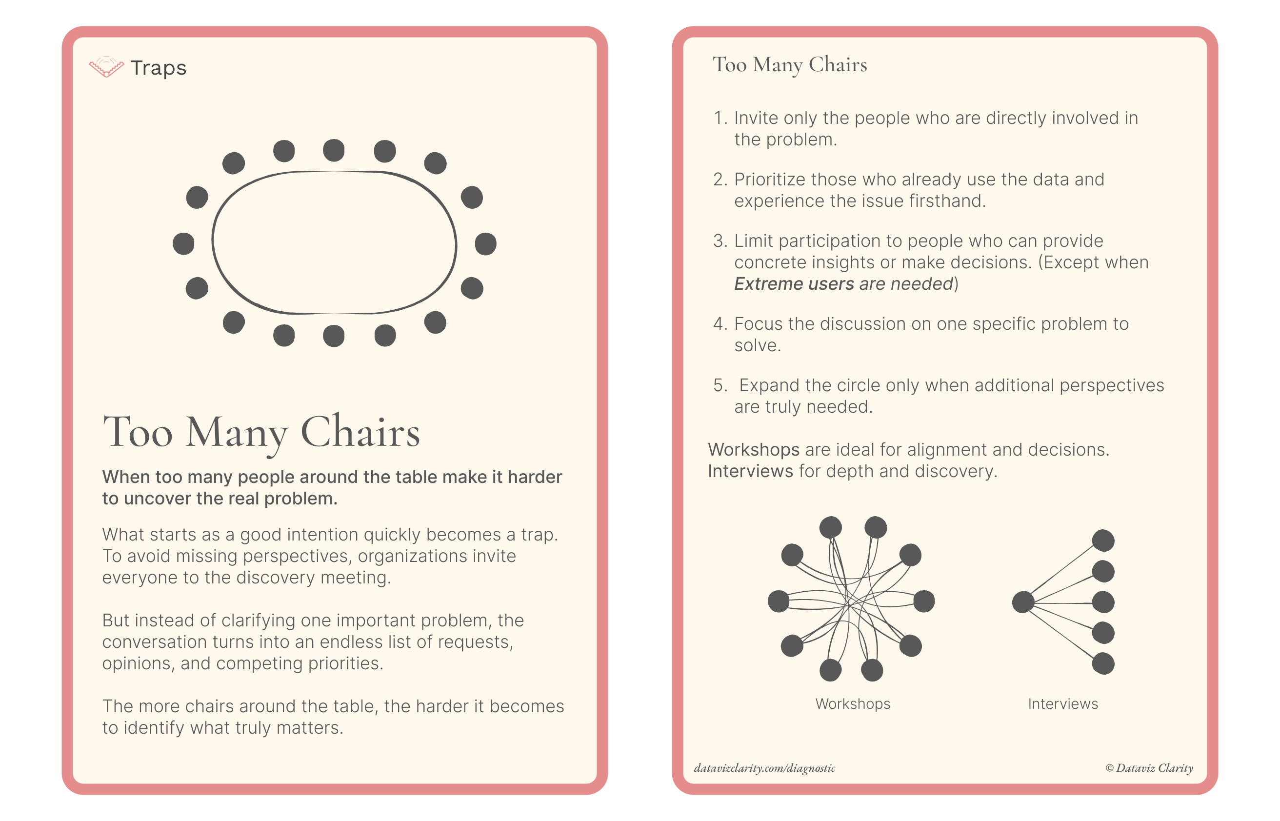
The first card is a "Traps" card called Too Many Chairs.

It describes a common discovery trap: inviting too many people to the table and turning what should be a focused conversation into an endless list of opinions, requests, and competing priorities.

I hope this card resonates with some of the situations you encounter in your own projects.

If this card feels familiar, there is usually a deeper issue behind it.

I'd genuinely love to hear what you think about this idea and this challenge. Even a simple thumbs-up or a short reply would mean a lot to me.

Do you find this format useful?
Could these cards help you in your day-to-day work?

Thank you very much for taking a moment to share your thoughts.

Announcement of the Week

The landing page for the Analytics-to-Decision Diagnostic is finally live.

In a free 45-minute session, I help organizations identify where their analytics operating model starts to slow down, struggle, or break.

From request qualification and KPI ownership to dashboard design and decision-making, the goal is to uncover the structural issues preventing analytics from creating real business value.

If that sounds familiar, you can book your diagnostic here:

Explore the Diagnostic

Have a great week everyone!

Aurélien

Responses

Join the conversation
t("newsletters.loading")
Loading...
I'm setting myself a challenge!
*]:pointer-events-auto scroll-mt-(--header-height)" dir="auto" tabindex="-1"> *]:pointer-events-auto scroll-mt-[calc(var(--header-height)+min(200px,max(70px,20svh)))]" dir="auto" tabindex="-1"> Over the coming weeks, I want to create at least 50 illustrations that capture the kinds of situations that slow organizations down. The frustrating, messy, sometimes seemingly unsolvable situation...
Ask three people what’s wrong with data. You’ll get three answers.
*]:pointer-events-auto scroll-mt-(--header-height)" dir="auto" tabindex="-1"> *]:pointer-events-auto scroll-mt-[calc(var(--header-height)+min(200px,max(70px,20svh)))]" dir="auto" tabindex="-1"> Last week, I asked a simple question in a survey: "If you could fix one analytics problem today, what would it be?" The answers were all over the place. Some said lack of actionsOthers said KPIs...
If you could fix one problem today, what would it be?
*]:pointer-events-auto scroll-mt-(--header-height)" dir="auto" tabindex="-1"> *]:pointer-events-auto scroll-mt-[calc(var(--header-height)+min(200px,max(70px,20svh)))]" dir="auto" tabindex="-1"> In my previous newsletter, the survey was broken.Classic marketing rookie move. Here it is again.Your answers would really help. Share your biggest issue  Have a great week! AurĂ©lien

The Dashboard Design Brief

What you’ll get every Tuesday A series of sharp visuals that decode common mistakes in analytics and dashboard design. Fast to read. Easy to apply. Hard to forget.
Footer Logo
Privacy Policy Terms and Conditions
© 2026 Dataviz Clarity