
Most analytics teams are skilled.
Few are positioned to solve business problems.
The more dashboards we produce, the fewer decisions are made.
The visible symptom:
- Strong technical delivery.
- Clean models.
- Fancy colors.
- Solid SQL.
The real problem is posture
Analytics is approached as a technical and functional activity, not as a problem-solving discipline connected to the business environment.
Teams focus on building what is requested.
Not on understanding what must change and why.
Charts replace questions.
Tools replace thinking.
This is draining
-
Development cycles spent on outputs disconnected from real business decisions.
-
Dashboards exist, but business teams keep working outside them.
-
Repeated misalignment creates fatigue and skepticism toward analytics.
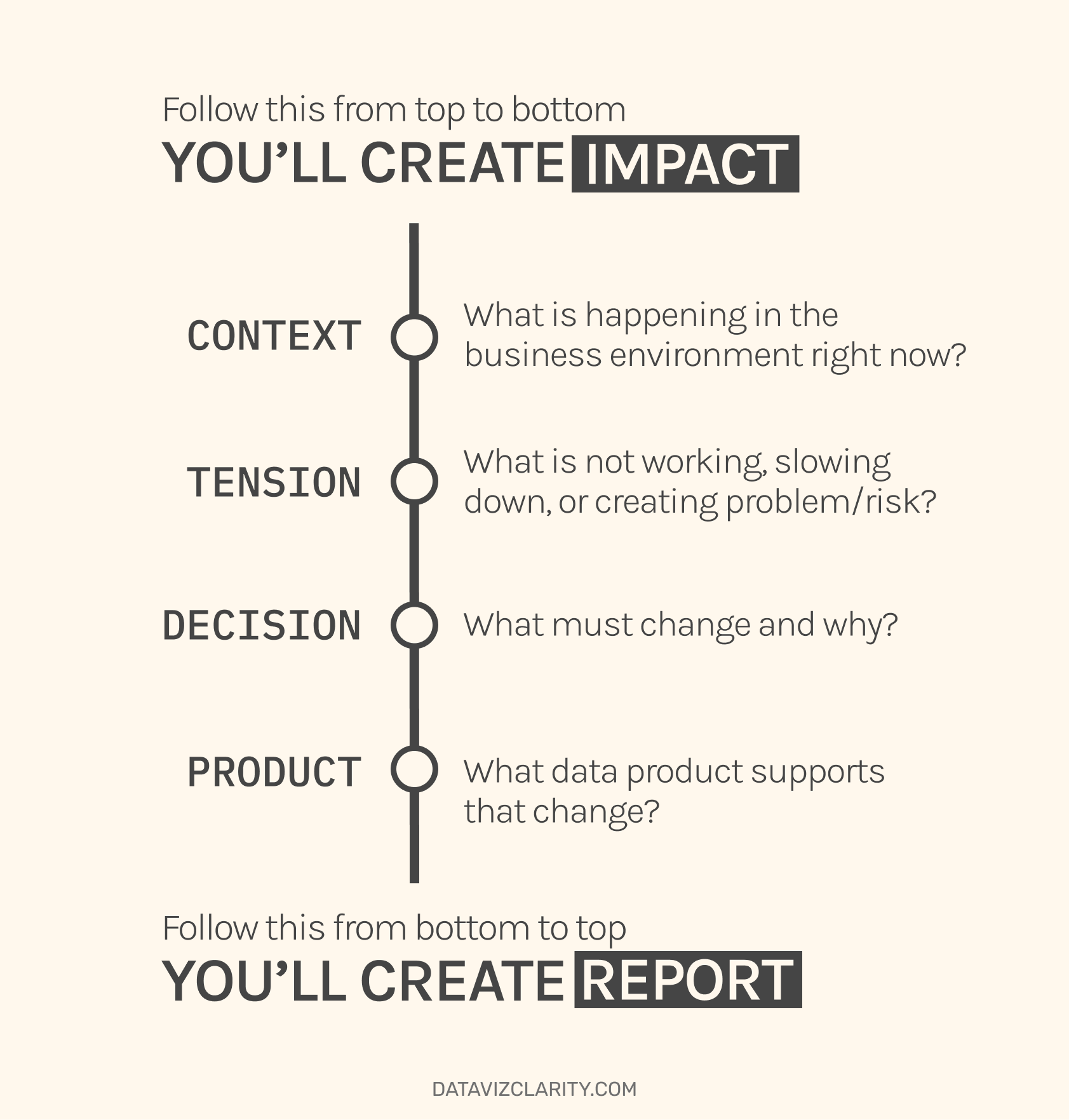
The Problem-to-Product Shift model.
-
Context: What is happening in the business environment right now?
-
Tension: What is not working, slowing down, or creating problem/risk?
-
Decision: What must change and why?
-
Product: What data product supports that change?
Reverse the order, and you produce reporting.
Follow it, and you produce impact.
Feel free to share the visual in your internal community
A real corporate example.
Real case experienced between June and October last year.
Here is what happened:
A junior analyst was given ownership of an internal dashboard. Technically capable. Fast. Autonomous.
For nearly 60 days, she developed the product with Tableau.
Everything looked solid.
I started auditing the Tableau workbook.
The business needs had not been understood.
The file was far too heavy.
Data preparation had been done directly inside Tableau.
Charts were selected for how "innovative" they looked.
It had been built to impress, almost like a portfolio, rather than to answer real business needs.
The dashboard was structurally misaligned with the real business questions.
KPIs were technically correct. Strategically useless.
After three months of work, the only viable option was a full rebuild.
Loss for the company : ~70.000€
Frustration across the team.
Trust weakened before the product even existed.
The issue was not skill.
It was the absence of a business-first posture.
And that’s exactly what makes the difference between a Data analyst who keeps the company’s challenges and business needs in mind, and a professional who simply plays around with Tableau and Power BI.
The Analytics Talent Spotlight
The Analytics Talent Spotlight section aims to highlight data professionals I have worked with and confidently recommend for their impact, mindset, and ability to contribute meaningfully within data teams.
 French speaking below

Responses