0

New workshop for Analytics teams now live!

Header Logo
Newsletter Blog Contact
Workshops
Design Principles for Analytics
Log In
← Back to all posts

How many KPIs are too many?

Feb 24, 2026
Connect

It depends. (ahah!)

KPIs are everywhere.
Across dashboards.
Across reports.

We use them constantly.
And yet, the questions remain.

  • Are they truly KPIs?
  • Are they actually key?
  • Key for others… or just for us?
  • How many KPIs is reasonable in one company?
  • Are they connected to business strategy?
  • Do decisions happen when they signal something?
  • A KPI is already a design choice

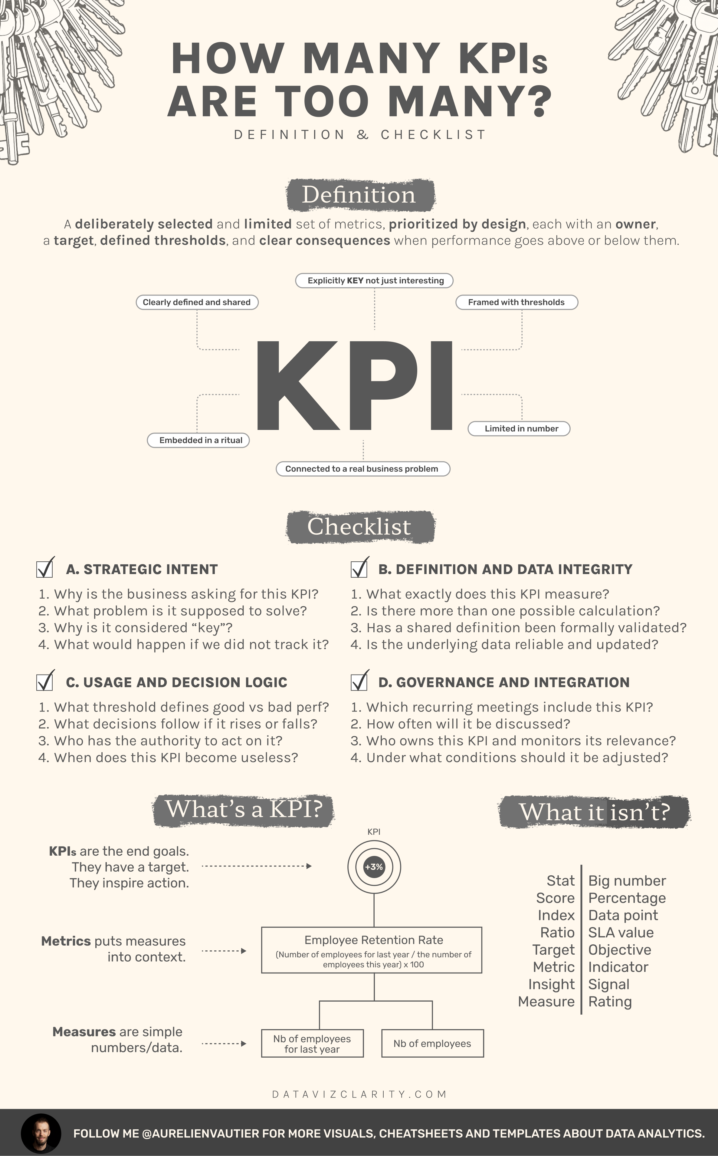
Click or right click to download

The moment you label a number as "key" you’re making decisions:

  • What matters
  • What gets attention
  • What deserves action
  • What will be reviewed in meetings.

Yet in most organizations, the word gets diluted.

Metric = KPI
Measure = KPI
Score = KPI
Indicator = KPI
Big number = KPI

At that point, KPI just means "a number we decided to show"

And then the list grows.

10 KPIs.
25 KPIs.
50 KPIs.
75 KPIs.

Which leads to a predictable outcome: nothing is prioritized anymore.

When everything is tracked and everything is labeled "key" you’re not prioritizing.

You’re avoiding prioritization.

You’re playing the game of:

  • track everything
  • monitor everything
  • treat everything as urgent

A KPI should exist because it:

  • anchors a business objective

  • drives a decision

  • has an owner

  • triggers action when it moves

If none of that is true, it’s a metric.
Useful, maybe.
But not key.

As a data analyst, if you’re tired of hearing that everything is a priority and everything is urgent, start pushing back.

Explaining that validating a list of 50 KPIs doesn’t create alignment.
It avoids prioritization.
And it helps no one decide what actually matters.    

Take the cheatsheet.
Share it internally.
Use it to challenge how you design KPIs.

If your KPIs don’t trigger action, they need a rethink.

BOOK A CALL WITH ME 

Have a great week everyone!

Responses

Join the conversation
t("newsletters.loading")
Loading...
Card N°2: Extreme Users
*]:pointer-events-auto scroll-mt-(--header-height)" dir="auto" tabindex="-1"> *]:pointer-events-auto scroll-mt-[calc(var(--header-height)+min(200px,max(70px,20svh)))]" dir="auto" tabindex="-1"> The second card of the Analytics Product Framework collection is now available: Extreme Users (Methodology card) One of the most common mistakes I see in organizations is avoiding extreme users dur...
The first card has arrived.
*]:pointer-events-auto scroll-mt-(--header-height)" dir="auto" tabindex="-1"> *]:pointer-events-auto scroll-mt-[calc(var(--header-height)+min(200px,max(70px,20svh)))]" dir="auto" tabindex="-1"> Last week, I challenged myself to start creating a library of cards. Each card captures a recurring trap, friction, or pattern I have seen repeatedly in analytics and BI teams. The goal is simple: ...
I'm setting myself a challenge!
*]:pointer-events-auto scroll-mt-(--header-height)" dir="auto" tabindex="-1"> *]:pointer-events-auto scroll-mt-[calc(var(--header-height)+min(200px,max(70px,20svh)))]" dir="auto" tabindex="-1"> Over the coming weeks, I want to create at least 50 illustrations that capture the kinds of situations that slow organizations down. The frustrating, messy, sometimes seemingly unsolvable situation...

The Dashboard Design Brief

What you’ll get every Tuesday A series of sharp visuals that decode common mistakes in analytics and dashboard design. Fast to read. Easy to apply. Hard to forget.
Footer Logo
Privacy Policy Terms and Conditions
© 2026 Dataviz Clarity