
The "slide" I’m presenting to a CDO next week
Data teams don’t have a dashboard or report problem.
They have a meaning and methodology problem.
They adjust:
- Colors
- Fonts
- Layouts
- Chart types
But three months earlier, they interviewed the wrong people.
Framed the wrong need.
And now they’re polishing a solution that makes no sense for its audience.
That is a methodology problem => Daviz Design Process
Then comes the second failure mode.
The process is finally in place.
But developers lack Design skills.
Interfaces become broken:
- Too many interactions
- Cognitive overload
- No consistency across dashboards
That is a Design principles problem.
There is no versus between the two.
They are complementary.
Design Principles improve execution.
Design Process clarifies direction.
Data analysts should start with Design Principles.
Then move to Design Process to rethink discovery, need framing, prototyping and product logic.
In most organizations with fewer than ~50 data analysts, teams usually need both.
In larger organizations, roles start to split.
Data analysts focus on Design Principles + the execution phase of the Design Process:
=> Ideation, Wireframes, Figma, Excalidraw, prototyping.
Product owners or product managers focus on the upstream Design Process:
=> Discovery, interviews, workshops, problem framing, prioritization.
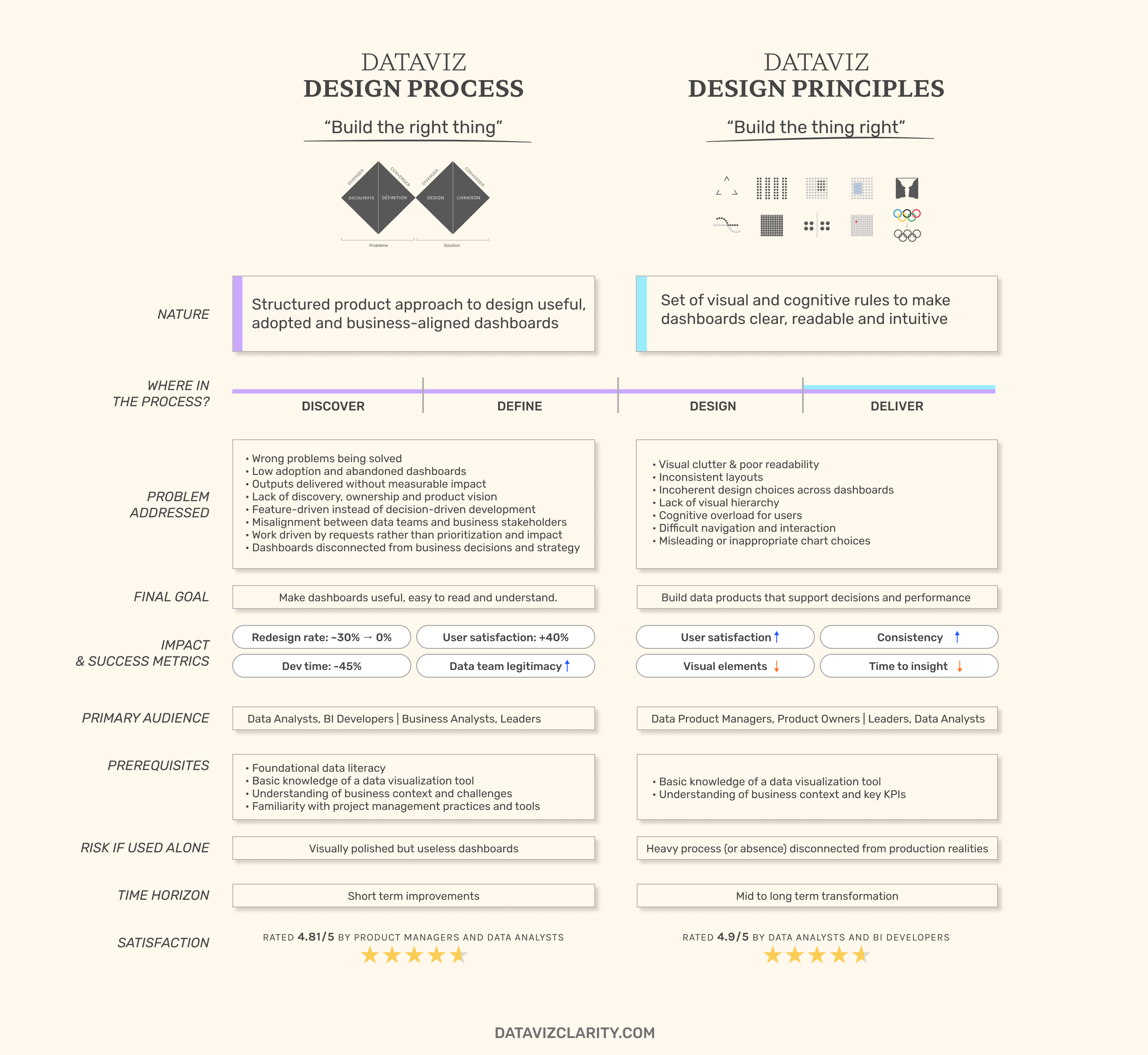
Click or right click to download
This slide was originally requested by a client from a German retail company (+100 Data Analysts).
We will present it to the CDO next week.
It quickly became clear to me it should be shared more widely.
Take it.
Share it internally.
Use it to challenge how dashboards are currently built.
If useful, I can also run a short presentation or share a more detailed slide deck to help you build internal buy-in.
And if this tension exists in your teams, one of these workshops will address it.
Have a great week everyone!

Responses