
Card N°2: Extreme Users
*]:pointer-events-auto scroll-mt-(--header-height)" dir="auto" tabindex="-1">
*]:pointer-events-auto scroll-mt-[calc(var(--header-height)+min(200px,max(70px,20svh)))]" dir="auto" tabindex="-1">
The second card of the Analytics Product Framework collection is now available: Extreme Users (Methodology card)
One of the most common mistakes I see in organizations is avoiding extreme users dur...
The first card has arrived.
*]:pointer-events-auto scroll-mt-(--header-height)" dir="auto" tabindex="-1">
*]:pointer-events-auto scroll-mt-[calc(var(--header-height)+min(200px,max(70px,20svh)))]" dir="auto" tabindex="-1">
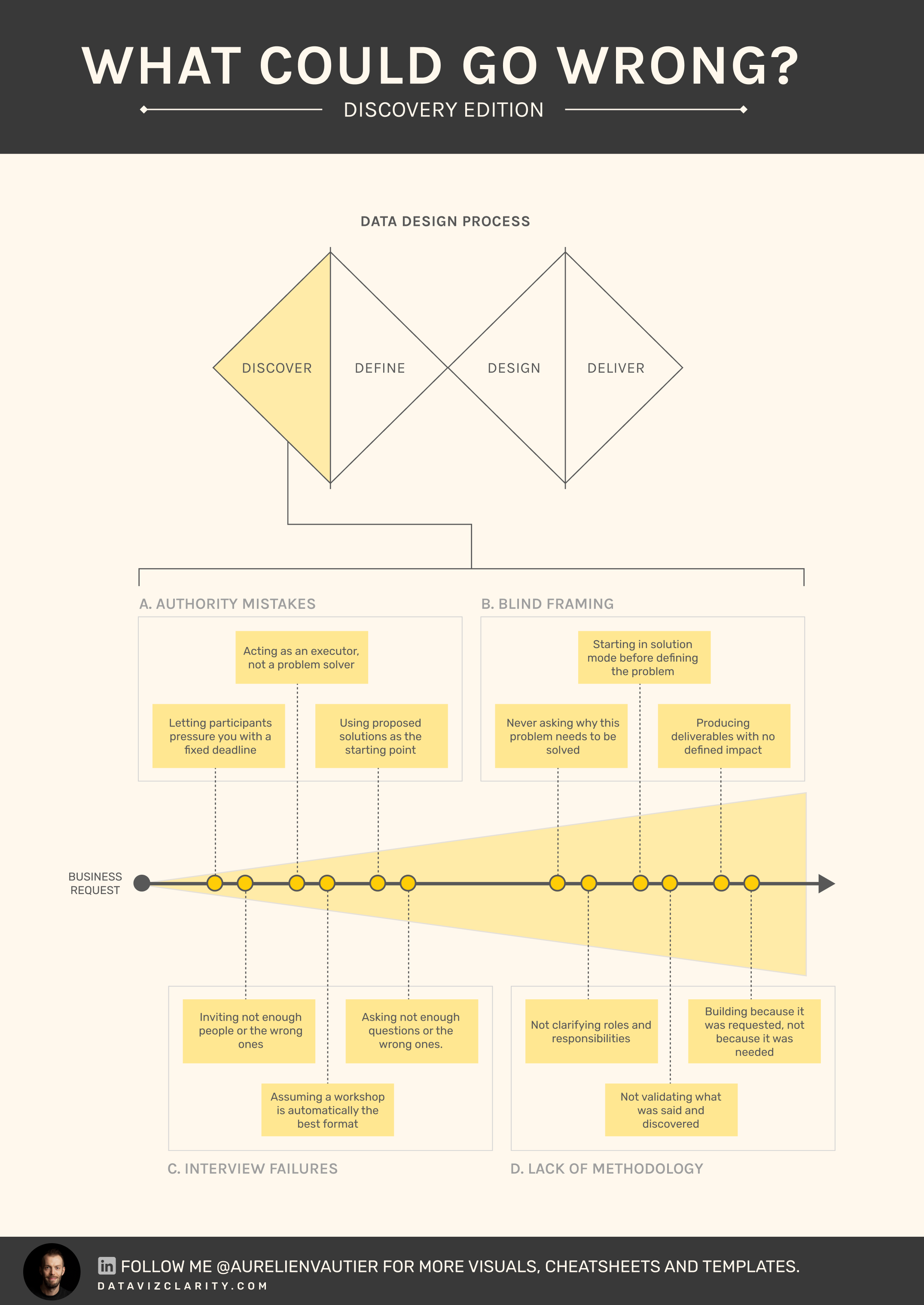
Last week, I challenged myself to start creating a library of cards.
Each card captures a recurring trap, friction, or pattern I have seen repeatedly in analytics and BI teams.
The goal is simple:
...
I'm setting myself a challenge!
*]:pointer-events-auto scroll-mt-(--header-height)" dir="auto" tabindex="-1">
*]:pointer-events-auto scroll-mt-[calc(var(--header-height)+min(200px,max(70px,20svh)))]" dir="auto" tabindex="-1">
Over the coming weeks, I want to create at least 50 illustrations that capture the kinds of situations that slow organizations down.
The frustrating, messy, sometimes seemingly unsolvable situation...

Responses